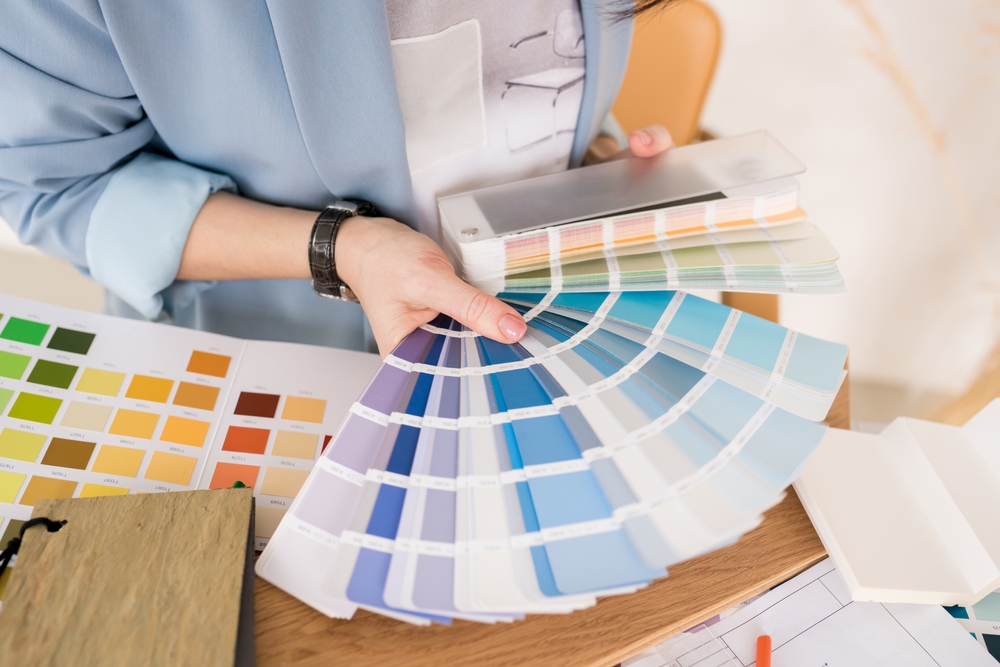
Decorating is an artistic expression for many, which means that using safe color palettes can be boring for some people who want to create a bold statement or work with the usual color schemes. If you’re ready to explore new color palette ideas, keep reading to get some inspiration and ideas.
Blue, Green, and Orange
The combination of blue or hues of greens and blue works well together, but you can add a punch of color by adding orange accent pieces. Try decorating primarily with a blue-to-green primary palate that consists of aqua, teal, or Seafoam, and then add punches of orange here or there. For example, use an aqua or teal couch and add dark orange throw pillows. You could even use an orange vase or throw a rug sparsely. It really draws in the eye and gives a fun yet not overstated sense of whimsy. It’s perfect for adding character to a previously dull space you use for relaxing.
Navy and Light Pink
Surprisingly, navy blue and light pink go very well together. This color scheme tends to work best with a navy wall with pink accents or using navy on an accent wall. Another option is to do navy half walls and borders while using light pink for window treatments, bedding, wallpaper, or even couches with navy throws. The trick is to balance the colors.
You can’t use the colors half-and-half and get a good result. You must carefully choose the primary colors and use the alternate color to bring depth and dimension to break up the room. This color scheme would work wonderfully for a sitting room or even a bathroom.
Green and Coral
Using deep green shades with coral variations works well when balanced correctly. The goal is to avoid overusing green. It works best with a border or accent color rather than the main color. You may consider using it with wallpaper, paintings, bedding, and even furniture colors. You can use the deep green for carpet colors and wall accents, or even paint your accent furniture green and use the coral throughout. When used correctly, it’s warm and inviting. Use this color combination in your bedroom or bathroom.
Purple and Blue
Purple and blue are closely related colors and work well together when blending like tones. Avoid using deep, rich blue next to deep or rich purple. Try using a bold tone with a softer contrasting tone. You may also consider using omber or pastel tones that blend well. Using bold and then soft colors has a big impact. For example, painting your room bold blue and then using soft purple accents would be quite interesting yet warm. In contrast, bold purple and light blue are fun and unexpected.
Find a Great New Color Combination For Your Interior Spaces
If you’re looking for new and exciting color palettes to add some flair and fun to your spaces, consider indoor house painting in Lansdale, or painting companies Main Line to provide you with the change you crave. Painting your interior spaces is the best way to incorporate a new color scheme into your interior design.
Our friendly and knowledgeable painting experts are ready to take your idea and make it happen. Find out how easy and impactful painting your home can be. Please contact us today for more details or prices for our interior painting services and let us help you create the change you want.
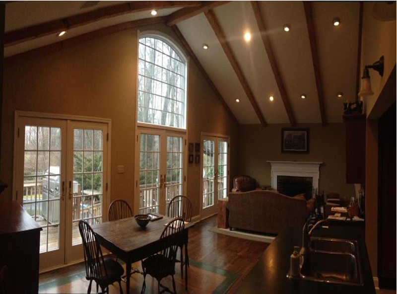
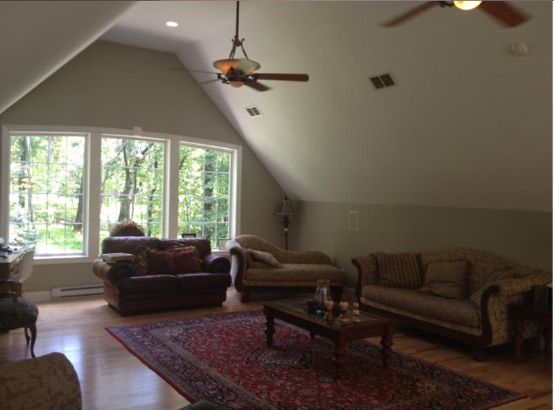
Our Interior Work
Our Exterior Work